|
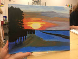
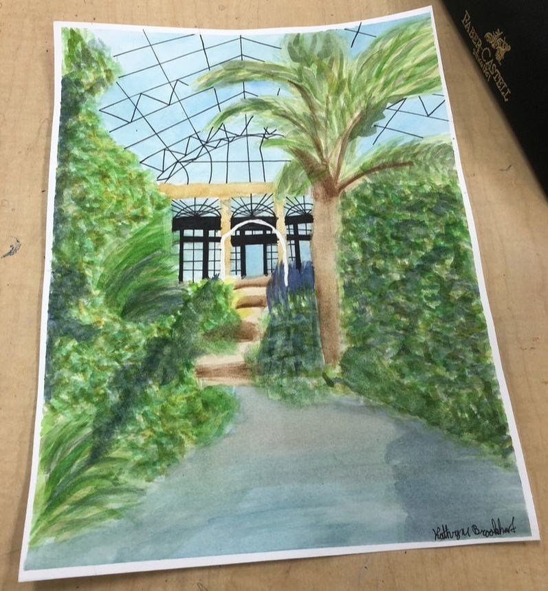
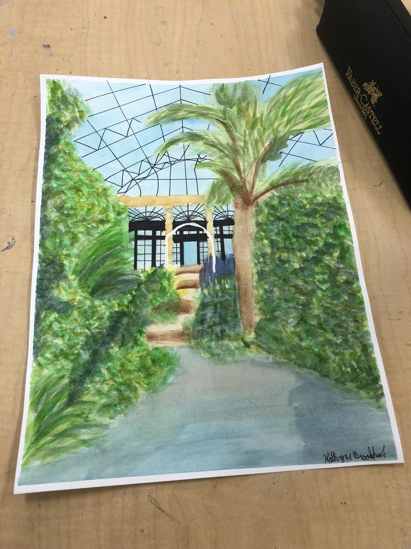
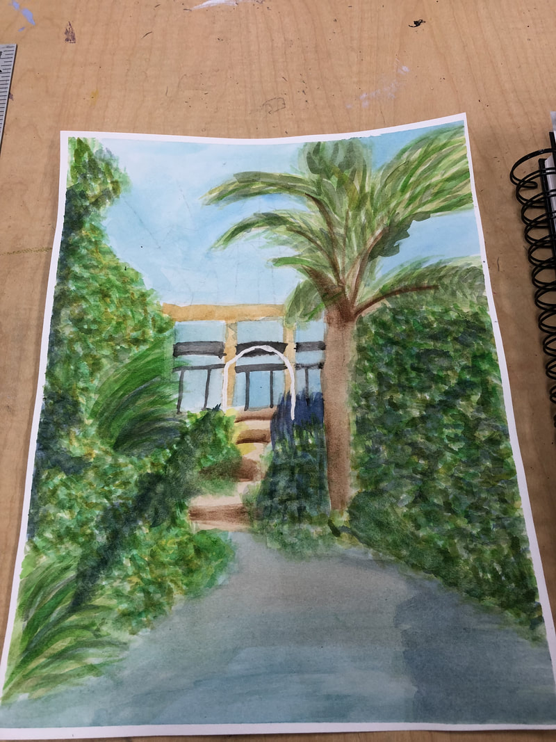
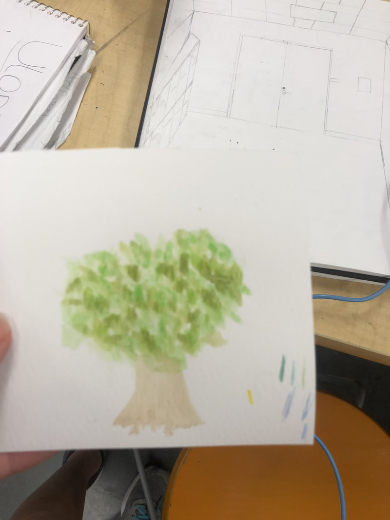
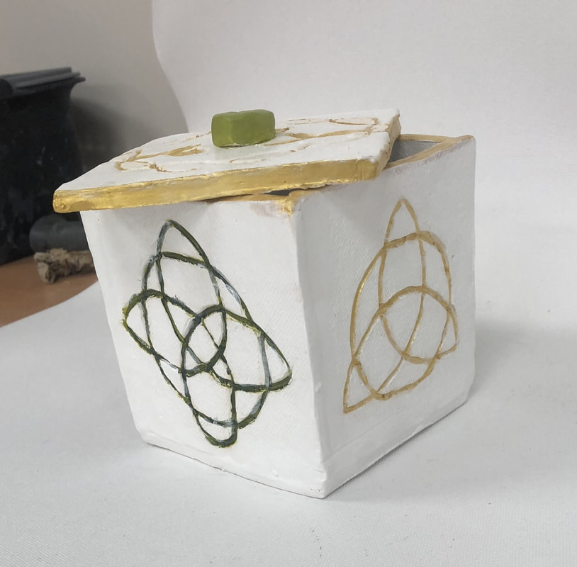
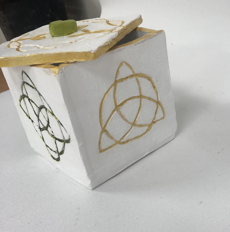
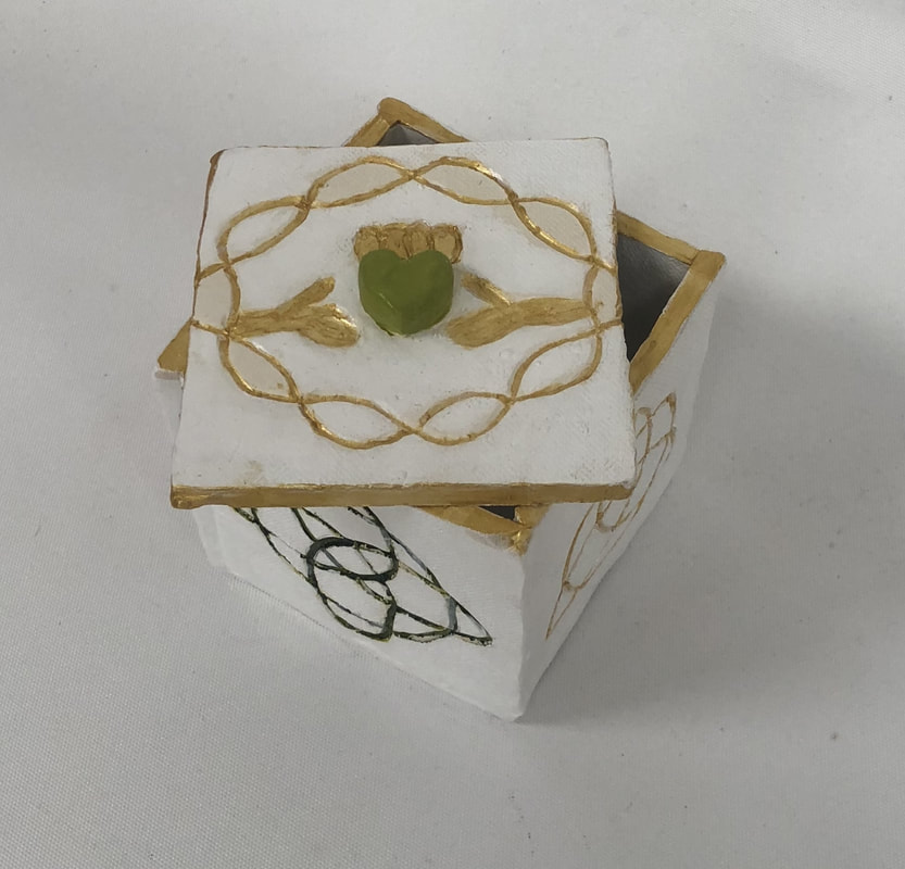
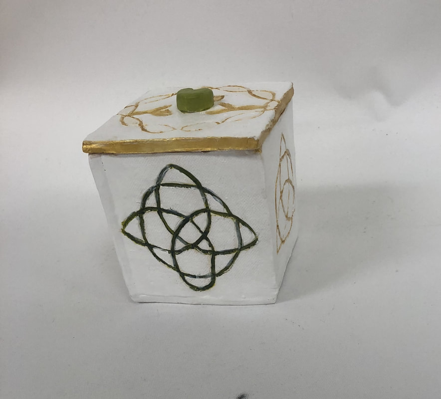
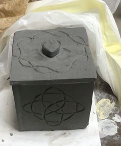
The art criticism process has 4 parts, describe, analyze, interpret and judge. In describe you list what you see in the artwork and the color schemes. For analyze you list the elements and design principles, for example the balance or harmony of a piece. Interpreting the piece is looking at the mood or feeling communicated. Along with the ideas represented or the story being told. Lastly for judge you say what you think if the piece and if it was successful. 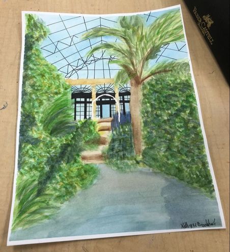 In this piece I see a garden with water and a walkway. This artwork has a pond in the front of the piece with grayed blue water. Over the edges of the pond there are different types of trees and plants. Each plant is multicolored with pale and bright green and yellows. In between the two sets of plants there is a walkway in two different shades of brown leading to a door way. The doors are glass window with black metal in between each window. The ceiling is glass and the sky is a bright blue with white mixed in. The element used in the piece are controlled and straight line, vertical and horizontal line as well. Also there are all three values in the piece, with more positive space than negative space. The proportion of each object or plant are equal and shows the dimensions of the piece. The mood of this piece is calm, quiet and relaxed. The feeling communicated is peaceful and the idea represented is a peaceful place to relax and meditate. I believe this artwork is successful because it gives off a peaceful feeling and is very realistic. This is shown by the detail in each plant and the windows.  I enjoyed working with acrylic paint and clay because the acrylic paint smoothly and stands out well. I liked using clay because I could model it into any shape and carve patterns into it. I did not use oil pastel but I wish I had explored it because of the colors and possibilities it offered being similar to charcoal.
These two pieces show how much I have grown as an artist because the one of the left is a piece from the beginning of the semester and the right is from the end of the semester. The projects are related because deal with painting a picture I have taken before and getting the details of the picture. The left is acrylic while the right is water color and pen, however both required drawing the picture out before hand and continually using the picture as a reference. The water color piece is more detailed and easier to see the image represented due to increased brush scale and attention to detail. 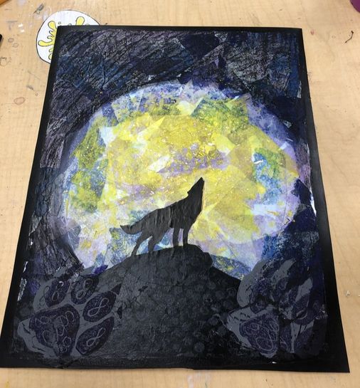 In this piece I used skills I learned in previous pieces like acrylic painting or using on my clay piece. I also used previous skills and techniques learned with charcoal and print making. My growth over the semester has been a large change with my attention to detail and brush techniques. Also my creativity levels are a lot higher and more active than they were at the beginning of the semester. I incorporated my acrylic skills and techniques when painting the wolf and mountains. I used my skills in charcoal to create the background of the sky for this piece and used my previously learned techniques in print making for the paw prints in the bottom corners.
0 Comments
Santa Fe Support Poster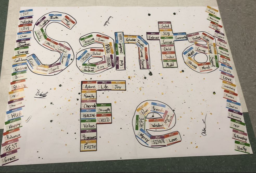 For my final project I decided to create a support poster for Santa Fe High in Texas. The inspiration behind this poster is from a Christian song "Hello My Name Is" by Matthew West. The song gives support and courage to those in hard places and those who feel broken. For the base of this poster I splattered green, yellow and gold acrylic paint. Next I took Hello My Name Is stickers and wrote encouraging words and phrases on them. Using the stickers I spelled out Santa Fe and put a border on the sides of the poster. Lastly I outlined the letters with marker and began to have people sign it. My plan is to get as many signatures as I can before sending it to Santa Fe.
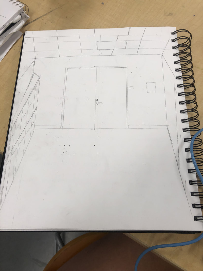
I used 1st perspective. The photo is a picture I took in Longwood Gardens in Pennsylvania. The photo is of a main entrance to the indoor gardens and green house. The most difficult part of the project was figuring out how to do the perspective on the picture and show the shadows in the plants and water. Also the trees and plants themselves were very hard to do with the wide variety of shades of green and yellow. The hallway drawing helped me because it showed me how to do lines in 1st perspective, which is what I needed to do with my piece. It helped me with the ceiling lines in my piece and how to make it look like its going to one point. The watercolor warmup helped me the most because I had to do tons of trees and plants in my piece and the warmup really showed me how to do those and make them actually look like trees and plants.
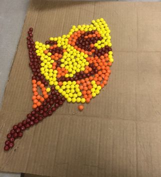
This portrait is a picture of me. I used skittles as my medium. I first started with my picture and edited it to be shades of orange by light contrasting. After editing the picture I traced the image onto the cardboard poster. Next I sorted the skittles into cups by color and used hot glue to glue down each skittle to the correct place matching the picture. The contrast of colors and the different lightings being shown was very successful. I might have used a food a little smaller to get more detail at the eyes and mouth.
So far the most helpful warm up for me in my portrait would be the face proportions. This is because my piece deals a lot with the proportions of the face and being able to fit the skittles in the different shades and contours of my face. Also the skeleton cartoon because I had to pretty much trace the outline or skeleton of my picture to begin working on my portrait. |
 Sketch | 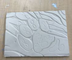 Linoleum |
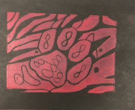
Finished Print
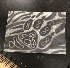
My piece shows off the theme of "line" by showcasing different thicknesses and lengths of lines. Also the curves that can be in a line used to create a shape.
My piece was successful because it showed different types of lines and shapes. Also it showcased the wolf paw print the way I was hoping it would and created an interesting print. I would change the three dots on the sides of the paw print to either move them farther away or not have them at all. Also the lines within the main pad of the paw I would change to create an Irish knot or a different pattern.
My piece was successful because it showed different types of lines and shapes. Also it showcased the wolf paw print the way I was hoping it would and created an interesting print. I would change the three dots on the sides of the paw print to either move them farther away or not have them at all. Also the lines within the main pad of the paw I would change to create an Irish knot or a different pattern.
Danyelle Cropper is my mentor.
Daynelle makes abstract pieces using shape or curved lines. Often she uses pencil mediums and sometimes crayons. The realistic pieces she creates always have a meaning and story behind them and use interesting colors at time to draw the observer in.
I believe I will benefit from it because she and I have similar likes and this will allow me to have someone to turn to when I need help with a piece or I am lost on what to do. I hope to get great advise on my pieces and feedback to make me a stronger artist.
I believe I will benefit from it because she and I have similar likes and this will allow me to have someone to turn to when I need help with a piece or I am lost on what to do. I hope to get great advise on my pieces and feedback to make me a stronger artist.
Author
A student in high school, Art 1.
Archives
May 2018
April 2018
March 2018
February 2018
 RSS Feed
